Grid Style In Modern Web Design: Showcase and Resources
A Grid is an invisible structure used to guide the placement of elements on your page. Now days using a grid are one of those basic design principles. Over the past few years, there’s been a lot of talk about grid systems and using column grids for website layouts. It’s easier these days to embed a audio/video on the web than it is to set type consistently or align elements to a universal grid.
Most news and editorial designers are working with grid systems someone else designed. No matter what you think about it, how you know about it, you need to understand how to use it. Here, in this Presentation, you’ll find everything you need to know about Grid Based Designs with some excellent resources provided by fallow designers and developers.
For those, who don’t know what is Grid-Style-Based system and what it can do? Then please follow the link below for detailed introduction.
The next generation, representing two decades of excellence. This grid-based system contains everything you need to create high-end design, artistic showcase, portfolios or otherwise very clean and minimal design.
You may be interested in the following related articles as well.
Feel free to join us and you are always welcome to share your thoughts that our readers may find helpful.
Don’t forget to subscribe to our RSS-feed and follow us on Twitter — for recent updates.
Grid-Style in Modern Web Design
Many of the pages that you see everyday using grid for optimizing web layouts. You may not see it but it is there, holding up the elements, structuring design, establishing layout, guiding the page elements. Before deciding when, why, and how to use a grid you need to know the elements of the grid and how to create it. While it is invisible in the final printed piece, you’ll need to be able to see it during page construction.
So, Let’s start with a brief introduction with grid style.
What is Grid-Style-Based Design?

A grid is a technique that comes from print design but easily be applied to web design as well. Web developers have only recently started to show a real interest in grid systems. It is hard to say why it has taken so many years for web developers to become interested in something that has been essential to the written medium in general since the 30s. The necessary technology (HTML and CSS) has been around for a while, but has only recently been applied to the implementation of grid-based layout systems for web pages.
If you looking for a effective way to communicate with your audience then grids can be consider as first priority. Grids are often considered to be the fundamental part of any aligned, ordered and optimize web layouts. A typographic grid is a two-dimensional structure made up of a series of intersecting vertical and horizontal axes used to structure content. The grid serves as an armature on which a designer can organize text and images in a rational, easy to absorb manner. It also serves as the framework for page layout which divides the page horizontally and vertically into columns and rows to help work to order the elements of the design. The text and images used on the page fit into place and align with one another according to the grid.
The lines of the grid themselves are not necessarily visible (although in some designs they are) but they are used by the designer to create the proper width and height of elements to align the page. It is commonly seen in newspaper and magazine layout with columns of text and images. One grid, or a collection of grids, may be used across an entire project to achieve a consistent look and feel.
How Does it Work?

A grid is literally a net of X by Y pixels. The elements on the page are then placed on the cell border lines and overall aligned on horizontal and vertical lines.
Ratios are at the core of any well designed grid system. Sometimes those ratios are rational, such as 1:2 or 2:3, others are irrational such as the 1:1.414 (the proportion of A4). This first part is about how to combine those ratios to create simple, balanced grids which in turn will help you create harmonious compositions. [markboulton.co.uk]
A grid is a consistent system for placing objects. There is really no limit to the grid layouts that can be created. You can either place all the elements on the unit level of the cells or you can simply define the overall layout in terms of columns and margins. However, in the literature for print design, you can find many variations of grids described but most are based on modular and column grids. Often you’ll encounter a mix of both types of grids.
Contradiction!!
This Grid pattern does not necessary apply to artistic and stylish web sites where the goal is to display an explicit non-standard style. There is no bound for using this style in modern designs if it’s not necessary.
Once the grid is established, it is up to the designer when and how to break out of it. This doesn’t mean the grid system in graphic design will be completely ignored. Instead, elements may cross over from column to column, extend to the end of the page, or extend onto adjacent pages. Breaking out of the grid can lead to the most interesting page designs. [about.com]
Always remember. There is no rigid rule to place elements in cretin way as the grid is only to help you to keep your design as aligned as possible so it can help you to create some smooth pathway for human eye. It is therefore ok for some elements if they are not placed on a grid to create a certain style or effect.
Showcase of Grid-based design
Stumbleupon

Tastespotting

PhilCoffman

Nytimes

Silnt

TimesOnline

Noobr

MichaelPaulYoung

Guardian

Area17

NationalPost

Aialex

Spanish-Portuguese

Macalicious

Frieze

Sundance

Wired

TheMorningNews

Portfolio

Coma

We Are Survival Machines

Uxmag

Wearehunted

Subtraction

Jrvelasco

TheGridsystem

Aigalosangeles

Ungarbage

Jansochor

Tnvacation

Edwardguillen

Qbn

Tutorials on Grid-Style-Based Design
Five Simple Steps to Designing Grid Systems

Following article written by Mark Boulton to elaborate, in some way, on how to correctly design grid systems. It’s quite a complicated field and so distilling it into ‘Five Simple Steps’ has proven to be quite tricky, so much so that He thought He wrote these series of tutorial to give you quick lessons about grid based designs.
Preface Part-I Part-II Part-III Part-IV Part-V
Designing Grid Systems for Flash

In this Tutorial you all can walk through the process of creating a grid for a Flash based site that will work for screen resolutions of 1024×768 and up. The beauty of creating a grid for Flash is that you can create a fixed grid and don’t have to be concerned with the user changing type sizes and screwing up the entire grid of the site. The only time you have to be concerned with a fixed grid is if you build a Flash site where the contents of the site repositions based on the size of the browser window, in which case you would have to figure out a fluid grid.
Using a Background Image Grid to Lay Out

you can apply the grid to the body of your page as a background image so that it displays behind your site. Thus you can use it to precisely line up your layout.
Setting Type on The Web to a Baseline Grid

In the long slow battle with browser support and platform inconsistencies, we’ve been able to bring more and more sophisticated print techniques onto the web—sometimes kicking and screaming. In following article you can learn how to setting type on the web to a baseline grid.
When and Why to Use Grids in Page Layout

Many of the pages that you see everyday have a grid. You may not see it but it is there, holding up the design, establishing structure, guiding the page elements. Here in the tutorial you can learn when and why to use grids in page layout for web design.
How to Gridding The 960

You might recall a certain dialogue on this site about optimal layout width for 1024px. And perhaps your astuteness leads you to recollect the ensuing dialogue about fluid vs. fixed width. in this article you can find background image grid + pixel ruler + column divisions for 960px-width layout, all in one mean little package.
Developing the Grid That Supports Your Design

Most of you might had many question about grids like Why is the grid important? You can live without a grid system, but should you? You can find your answer to all of your questions in this article.
Designing Blog Theme Templates With Grid-Based Design

Here you can learn how to design grid-based theme for open source content management systems, e.g. Drupal and WordPress. The purpose of this article is to give you an idea of how to approach blog theme design using a grid system. After reading this, you should be able to create a fully-functional grid-based design and HTML prototype that can be converted into a theme template.
Articles Related to Grid-Style-Based Design
- Introduction to Layout Grids
- Why Use a Grid?
- Overview on Grid-based Layout
- Grids are Good – PDF format
- Grid-Based design 101
- Grid-Based Design: Six Creative Column Techniques
- How to Compromise Columns in Grids
- The Grid: The Structure of Design
- Method to Enable the Vertical Positioning in Grids
- Grids: an invisible foundation
- Thinking Outside the Grid
- Grid Computing… and Design
- The Funniest Grid You Ever Saw
- Feeling your way around grids
Free WordPress Themes Using Grid-Based Design
Particles

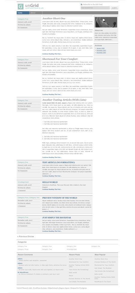
UnGrid

Gridalicious

Grid-Focus

Equilibrium

Tools for Grid-Based Design
- Grid Designer 2 – Popular tool for setting up simple grid layout.
- Grid Maker – Tool which help you design a grid
- 960 Grid System – Grid system for the typical 960 width
- GridMaker 2 – Downloadable application for grid-based web design mock-ups
- CSS Grid Calculator – Online application for page layout visualization to draw grid.
- Grid Calculator – Online calculator for creating grids.
- TypoGridder – A LGPL JavaScript to add baseline grids
- Web Page Layout Grid – A large image to use in the body background of your page to help you lay it out.
- Layout Grid Bookmarklet – One more Photoshop style Layout Grid image to use in the body background
- Grid Overlay Bookmarklet – variation of Layout Grid Bookmarklet.
- Phiculator – A smart application to calculate corresponding number by entering any number according to the golden ratio (1 : 1.61803399…)
- Typographic Grid – Tool for getting things to line up according to a strict horizontal and vertical grid.
- GridFox – GridFox is a Firefox extension that overlays a grid on any website
- Ruler Tool – A simple background image that will help you get an idea what’s going on between browsers and platforms
- Browser Grid – A browser grid to help you know the safe area for different resolutions of the picture.
Find Something Missing?
While compiling this list, it’s always a possibility that we missed some other great resources. Feel free to share it with us.
This is one kickass post! A wonderful resource for everything grid and very very useful. Thanks!!
As usual, very good grid based designs. Cool really.
Great article, I bookmarked you link for one of my resource article.
I also want to share to you a tool for web designer called Design by Sprymedia. This tools is my favorite one :D
Design is a suite of web-design and development assistive tools which can be utilised on any web-page. Encompassing utilities for grid layout, measurement and alignment, Design is a uniquely powerful JavaScript bookmarklet.
goto: http://sprymedia.co.uk/article/Design
Great post thanks for all the useful info
Nice collection, but neither of your first 2 examples even line up with the grids displayed on them :P
Nice article :D this is going to help me a lot on redesigning of my web site!!! thanks
This is a great post and thank you very much for putting in the time to research and put it together. I have mentioned it on my Josef Müller-Brockmann blog.
To use a grid design system is really good and professionally made. The elements in the web page are well manage and segregate. Business sites must be designed with that kind of grid system.
Any idea what CMS is used by the second example tastespotting.com
The page source of that site doesn’t say wordpress anywhere.
This website uses WordPress as the CMS and seems like it’s inspired by sites like NOTCOT.
Website: http://www.environmentteam.com/concept/
Yes. this is very timely and a great resource.
Very impressive post!!
Another classic showcase you have posted. Love it.
good collection of images and i will used as possible in my site..
Thanks
superb postings!